How do you reinvent a brand in the midst of a major transition? Following regulatory changes, Leumi Card, one of Israel's leading credit card companies, separated from its parent bank, Leumi. Leumi Card needed a new name, identity, and visual language that would establish their independence while maintaining broad brand recognition and their status as a household name.
Leumi Card needed a bold and differentiated brand that would create strong recognition and memorability with retail and business consumers. Their new name and identity had to enable a smooth transition from Leumi Card to their new brand.
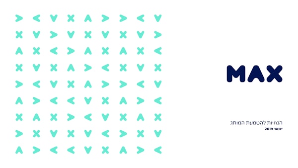
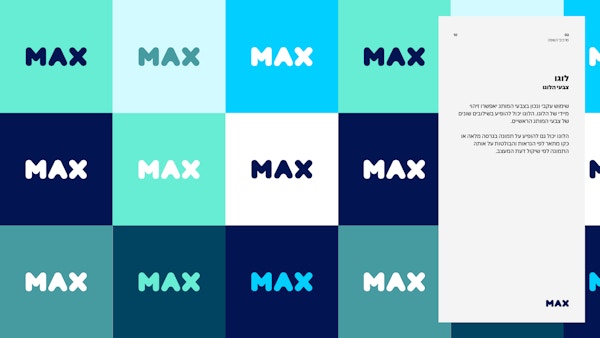
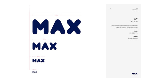
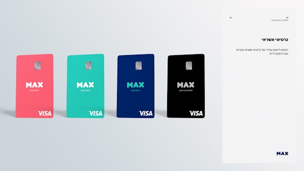
Our teams worked together in a series of workshops to define the new brand personality, identify a brand name, and create a visual concept. These building blocks informed the design of a new logo, a new font, credit card designs, website and mobile app. The new brand encapsulates its promise right in its name: max – making the most out of your money. The logo is sturdy and bold, differentiating it from financial players on the market while keeping it simple and memorable for customers.
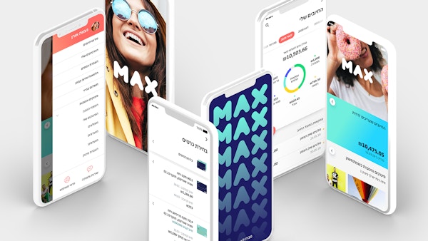
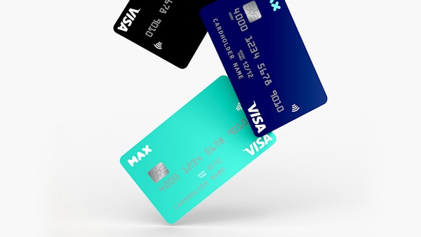
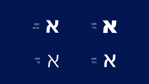
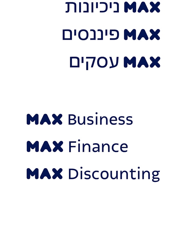
We evolved a comprehensive visual language and a bespoke font from the logo. The max font, designed with Fontef, brings English, Hebrew, and financial information together while being confident and conversational.
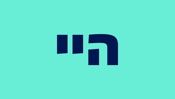
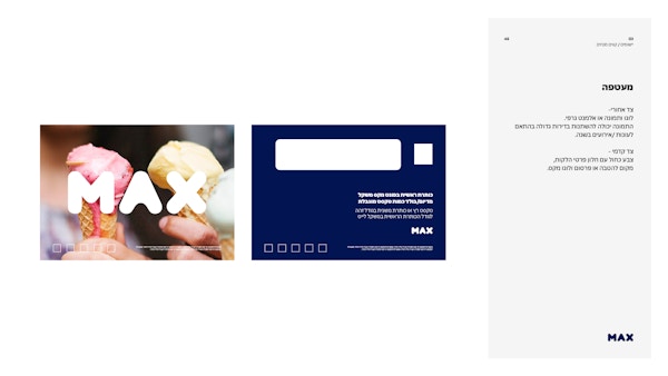
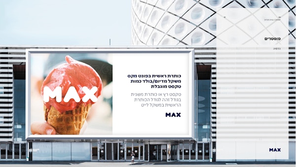
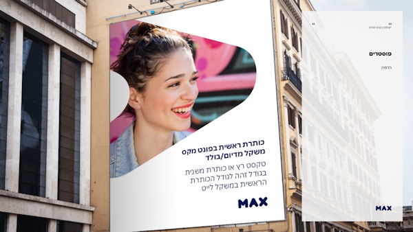
The logo can stand alone as a graphic element, and the letters in ‘max’ – stylised as an upward-facing arrow and other simple shapes – are used in patterns throughout print and digital materials. To enrich max’s brand expression, we led a photoshoot with a team of photographers, using a style that depicts realistic day-to-day situations and Israeli locality.
Details
Get in touch
